


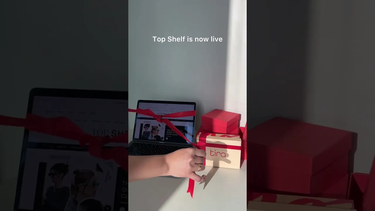
Project Brief
To re-design a dedicated editorial section that delivers expert-led content that informs, inspires, and drives purchases.
Duration
3 Months
Design → Development → Launch
Role & Team
Skills
about the company
Tira, a subsidiary of Reliance Industries Limited (India's largest conglomerate), is revolutionizing the beauty industry through technology and AI
Location
Mumbai, India
Hybrid work setting
Industry
E-Commerce
4.1 Stars
Backed by data
Problems with Existing Topshelf section

Placed on 12th position, 6th scroll. Most users never scrolled that far.
Once the articles were replaced, there was no way to access them.
No structure for revisting, bookmarking, or filtering the content.

statistics we received from the ux research team
Business vs product requirements
Every design decision through the process was anchored in both business intent and product feasibility.


SOLUTION : A LOYALTY PROGRAM
Wireframes accounted for the complexity of navigation, bookmarking, and filtering. Scalability was a key consideration throughout the process.

A 2 level filtering structure
• L1 Filters define the broad theme.
• L2 Filters are specific interests.
L2 filters can be layered on the L2 category. This gives users control over their browsing experience — starting broad and narrowing down.
Article card design
Focus: Hierarchy. Scalability.
trade offs in desktop vs mobile design
The 'All Articles' section was designed to serve as a endless feed content.
On desktop, the available real estate allowed greater creative freedom. We leveraged this to craft a more dynamic card sizes and a flexible grid. The mobile version prioritized clarity and scroll efficiency, using a more linear layout.

learning : Making trade-offs that matter
The biggest takeaway was realising the power of interdisciplinary collaboration.
Working with UX Reseach and Data Science teams allowed us to translate user behaviour into lucrative features — a process that now reflects in how TopShelf contributes to a measurable percentage of platform sales.
View More Work

Customer Retention for Tira Beauty

Space Exploration with Astr